Outside


Tom Allen, Ed Johnson, Julika Lackner, and Rachel Ritchford
Curated by Jeremy Gilbert-Rolfe
May 7–June 4, 2016
Gallery Hours: Tuesday to Saturday, 11–6 pm
Opening Reception: Saturday, May 7, 6–9 pm
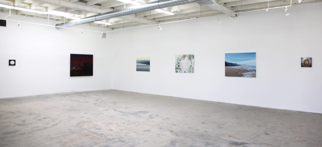
MIM Gallery is pleased to present OUTSIDE, a group show of paintings by Tom Allen, Ed Johnson, Julika Lackner, and Rachel Ritchford. The exhibition is curated by Jeremy Gilbert-Rolfe.
———
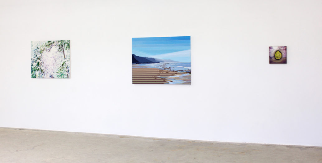
Paintings are spaces hung on the wall.¹ Cézanne famously said that anyone could make painting represent deep space, the white canvas with which one began was already deep, the artist just needed “to carve it out.” Each of these painters does something quite different with painting’s ready-made depth, carving it not being quite what any of them do, one thing they have in common is that their techniques tend to be additive rather than subtractive. Also, as is much less the case with Cézanne, and in a way that is different in each artist, the photographic hovers over all these paintings, as actuality and idea. All the paintings use color that is influenced by photographic color, for example. None of them give us landscapes in which that meeting between the colors of nature and those of the computer is not a big part of our experience of the work. It is also quite important that we don’t necessarily notice that at first. The show has the title ‘Outside,’ because the paintings refer to exterior space rather than to any interior, they bring the space of the outside into the gallery in which one is looking at them. They are small paintings which communicate, embody, or express, big space, usually, but not in all cases, seen at a distance. They are not only small but the viewer is led to look closely at them, not only for that reason but because of how the surface constructs or affects one’s experience of the space.
One may say that they are, in this, themselves in or about another but contiguous outside. In being paintings in which perception and concentration play a big part, while a fixed idea of what painting as a medium or historical fact may be said to be plays no part at all, they are outside the approach or approaches that are currently most influential in the art world as a whole. As a rough guide to the difference between work of these painters and of the latter sort—which constitutes a general attitude to painting that it will be easy for the viewer to find in other galleries at this very moment I am quite sure—I’ll invent a useful parallel between two influential painters who had their first shows in New York at the same time, Alex Katz and Andy Warhol. The date was 1954, more than sixty years ago and an art historically significant year, besides Katz’ and Warhol’s shows it is also the date of Jasper Johns’ American Flag painting.
Andy was an illustrator. His vast influence has been one in which the possibility of painting as a matter (literally) of surface and the perception of a space that is embodied in it while not really being there, has been totally erased and replaced by painting which refers to things by representing signs, and/or—at the analytic, avant-gardist end of the general tendency, being about a definition of the medium in some way. Alex is rather different. While giving a talk about Franz Kline recently, Alex reminisced about how an artist (whom he didn’t name) told him at the opening of his first show that “Figuration is dead and color is French.” Alex didn’t mention (although he surely knew and could have) that Kline’s black painting began with a drawing of a chair, which de Kooning had Kline project out of focus on an overhead projector to see what might happen. It’s interesting or something that the guy at his first opening didn’t mention it either. That aside, figuration obviously did not go away, but it did bifurcate, and this is most clearly so in the case of color. On the one hand colors that only came from print of all sorts, never from France except when the original image is a fashion photograph. On the other hand color which, however influenced, continues to be French. Because ‘French’ is in this context a code-word for impressionism and Cézanne and their consequences, color which produces affect rather than denotation, another way of saying that it does not allow perception to be bundled away into a concept and, in that, stopped. I suggest that one think of the work of this show as having more to do with Alex than Andy—with among others the caveat that I don’t know what any of these artists actually think of Katz’ work.
I mean, in encouraging this (provisional) distinction, to suggest that the viewer look at these works as paintings rather than pictures. They are pictures too, but in paintings it’s the surface that embodies what the artist is doing to and with space. Ed Johnson’s painting of a photograph is one version of the kind of thinking this involves. Reminiscent to ancient critics of Johns’ advice that the way to make a work of art is to make an image, and then do something to the image, Johnson’s painting slows down the instantaneity of the photographic by carefully (which is not necessarily to say meticulously, let alone laboriously) reinventing it in brush-strokes—thousands of small marks in place of no mark, an homogenous surface morsellated.
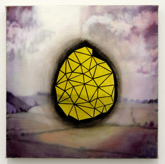
To extend this general principle to the other three artists, one may say that the way in which each of them refers to the photographic is similarly a key to how the singularity of each practice may be described. Cinema is where the close-up become a customary complement to the long shot. Likewise, the sudden and the languorous as part of the same scene. Rachel Ritchford’s Landscape with Expressive Gesture (2013) is made of a depth surmounted by a decisive action. It reminds me of Richard Serra, inevitably, but I should say that if that analogy has any value it would be in turning one’s attention to how both the far and the near, proximity and depth as much as figure and field, compete as a piece of sculpture and its environs cannot. This is because the painter gets to choose the background, which here as also in Tom Allen’s paintings is what conditions our experience of the space as a whole, dependent though it may be in both case on the figuration it supports—a black almost- circle floating in or suspended above a depth without limit, which while deep also advances because it’s yellow, guaranteeing uncertainty; a crow in a desert made possible by Technicolor, a sky pulsating as a photograph can’t because it’s not made of lots of marks, an image of uncertainty, and because it’s an image therefore of an uncertainty of a more pointed or specific sort than Ritchford’s.
About Allen’s use of color I should say this, one may mention color film (including that of animated cartoons, in my opinion) but one should also think of Gustave Moreau, twice over. Once because purplish paintings which are made out of symbols and symbolism, and where knowing what the artist intended in how he uses those terms really helps, inevitably bring up Moreau. In his symbolism I think Allen far more subtle than Moreau, but I think also more achieved than the generality of his peers in using Moreau’s creepy palette. This is because he uses the purples and dark blues and red of film, but doesn’t lose sight of what they actually feel like in nature (or in a Cathedral, the heavy darkness of which is dissolved by the photographic image.) That is why I’d say that he makes paintings which could only be made with oil paint, but with colors no one would have imagined without film, another example of doing something with something rather than leaving it exactly as it was.
Like Ritchford’s, Julika Lackner’s paintings involve one in a thought about distance, about the near and the far and with that one about how far away one is from where the space starts. Like Allen’s, they remind one of color and other things one knows, but then again not really. They are for example a bit Deco in the way the geometrical is used and this recalls central European painting from between the World wars, American inter-war painting comes to mind too. And where Allen’s painting recalls film, they of course bring post-cards to mind. But then there is the kind of light the paintings contain or emanate because of Lackner’s use of metallic leaf to pump up the luminescence, which originates in Wright of Derby’s use of silver-leaf to paint glass convincingly. The surface of the painting is, the way and in this case, with what, it’s painted, is what makes the space be what it is, as with the others.
One could point here, too, to the faintly kitsch subject matter of the sea-side (where the space disappears into atmosphere long before one might reach the clarity of an horizon,) and Allen’s desert with crow (or, more ominously, nothing.) This goes I think to the reference in both (in my view) to prints: lithographic posters from the thirties in Lackner, children’s books in Allen. In both cases this leads the work to color combinations which originate outside of painting but also precede film. There is no room in which to pursue the implications of that here but, since it involves the culture at large, anthropologically as it were, it is at least worth noting, it bridges the gap between popular art being made of bright colors based on the painter’s color wheel to now, when our color sense is informed by film and video’s (photography’s) different complementary color combinations—e.g., not red-green but violet-green, etc. Also because of space I cannot develop here the use of the absolutely ordinary in Ritchford and Johnson, which in my view parallels the reference to the popular noted in Allen and Lackner. Johnson and Ritchford both seem to me to be about staring at nothing in particular. My very first encounter with Ritchford’s work made me think of Uta Barth’s photographs of landscape without the lens being focused on any specific thing, but rather on some indeterminate point in the space before the horizon.² Johnson studies the light, remembered by the photographic, re-intensified by becoming paint, of very carefully selected examples of very ordinary things. Distance as something also close by or immediately present—as is always true of the sky, for example—has I suspect in Ritchford something to do with coming from the Mid-West, where it’s pretty flat. Her paintings present us with sudden juxtaposition without drama.
These echoes of kitsch and assertions of ordinariness, and, in Richtford, of what it’s like to be fascinated by a shape in the clouds, or something else in the sky or far distance, go with all the paintings in this show being small. There are lots of big paintings around which don’t take much looking at, one just has to know what their importance is said to be, while these are small paintings which one can (should) look at for a long time. Their importance is obviously at least two-fold. Regarding the guy who told Katz that figuration was gone, figurative painting never goes away because nothing stays the same and therefore the task of representing is constantly there. The same thing goes with regard to naturalistic color, given that nature does and doesn’t stay the same, which is by definition and default equally true for the subjectivity that sees it. The works of these painters, after photography and therefore with the photographic inside them—as, also, is kitsch, which Walter Benjamin said in the thirties our dreams are now made of—suggest I think that ‘French’ color, i.e., color as light and space, perception and surprise rather than recognition and confirmation, remains active in or maybe just outside the limited definition of contemporary art which for some rather long time now has held sway in all the places where sway is held.³
Jeremy Gilbert-Rolfe, Los Angeles, April 2016
1. There is of course a large body of opinion in contemporary art that insists that paintings are not spaces but flat things. This reminds one of what John Pope-Hennessy said about how, when in charge of the Victoria and Albert Museum, he had the job of showing Margaret Thatcher around when she became Prime Minister. He came to the conclusion that her best kept secret was that she was blind, unmoved as she was by all the art he showed her and brightening up only when she got to the conservation department and could talk to people about glue.